Introduction
The BCG (Boston Consulting Group) Matrix is a widely used strategic model and is still discussed in many strategy and marketing textbooks. In essence, it is a strategic model designed to compare competitive strength (using the metric relative market share) against market attractiveness (using the metric of percentage market growth).
In this article we work through how to construct the BCG matrix step-by-step in Microsoft 365 using Excel. You can either:
- Review the following article and it show-to steps, or
- Follow the steps in the video below, or
- Download the free Excel template for making the BCG Matrix
Video Instructions for Making the BCG Matrix in Excel 365
Step-by-step Instructions on How to Make the BCG Matrix in Excel (Microsoft 365)
STEP 1: Set up your Data
Before we start making the BCG matrix, we need to ensure that we have our data set up correctly. The following table shows the columns that we need to include.
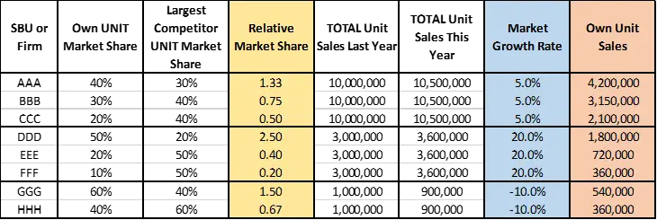
Let’s work through the above table quickly.
The first column is the firm or business or SBU (strategic business unit) name that you want to include on the matrix.
The second column is the UNIT market share of the firm. This is a percentage. You may choose to use REVENUE market share, if you consider that to be more appropriate. However, please note that the original construction of the BCG matrix relied upon unit market share as a proxy measure for competitive strength, and superior production volume would lead to economies of scale and experience curve benefits.
The third column is the UNIT market share for the firm’s largest competitor. If the firm is the market leader, then they will use the second largest company in the market. For all other firms they will use the market leader’s market share as their largest competitor.
The fourth column – in the yellow color – is Relative Market Share – which will be graphed on to the BCG matrix as the horizontal (X) axis. It is simply calculated by dividing the second column by the third column – the business’s market share by the market share of their largest competitor.
Please note that as a consequence of this calculation, you should only ever have one player (in the same market) with a relative market share greater than one – this would be the market leader. Firms that are not the market leader will have a relative market share of less than one.
The fifth and sixth columns are total UNIT sales for the TOTAL market (for all firms). This information is only required to calculate the seventh column – market growth rate percentage – which is the vertical (Y) axis on the BCG matrix.
Please note that if you already have the percentage growth rate for the market, then you do not need to include the fifth and sixth columns.
In the final column, there is unit sales per firm/SBU – and this can be used in the BCG matrix for the size of the circles – with the bigger size being a more dominant firm. Alternatively, you could use market share information for circle size, but overall unit sales is probably more reflective of strength and market dominance.
STEP 2: Insert a Bubble Chart
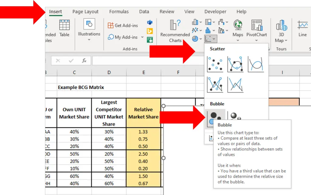
On the top Excel menu click insert, and go to the bubble/scatter chart icon and then click on the first bubble chart icon, as shown below.
This will produce a blank box for the chart – there is no data or anything else in it at this time, which is fine, as you will select the data for the BCG matrix in the next step.
STEP 3: Select Data for the Chart
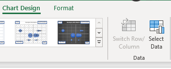
When you click on the blank box for the chart, it will bring up the Chart Design menu in Excel, as per the following image. Click on click on Chart Design and then click on the Select Data icon.
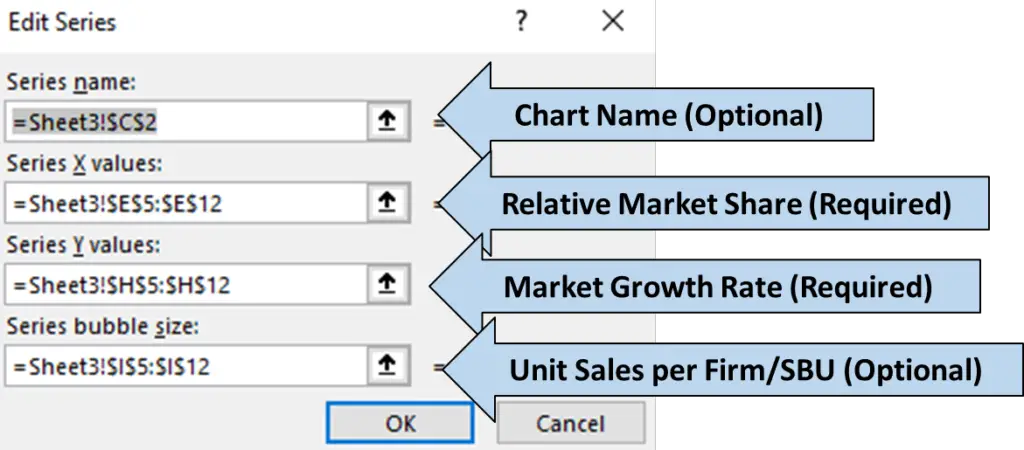
This will then bring up the edit series box, as shown below. There are four possible inputs.
For the series name, you can type in your chart name, or click on a cell where it is contained. This is an optional step as you can enter/change the chart title with the chart edit functionality, if required.
For the series X values, you need to select the relative market share data that you have calculated and prepared, as per Step 1 above.
For the series Y values, you select the market growth rate data, as also prepared in Step 1 above.
And then finally for series bubble size, you should select unit sales per firm, or other suitable metric. Please note that this is an optional input and if you do not include it all the bubble sizes will be the same in the matrix.
STEP 4: Add Data Labels
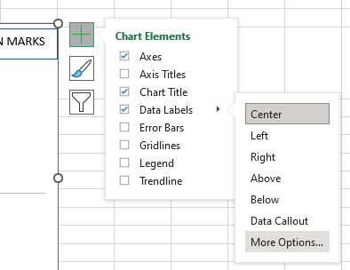
When you click on the chart box, it will bring up a menu to the right, which includes a large plus button, as shown in the following image.
And when you click on the large plus button, a submenu appears. You will then want to select Data Labels and then select more options, as shown below.
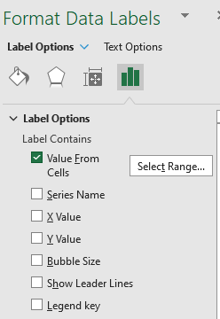
When you click on More Options it will bring up menu box to the right as shown below. You want to select Value From Cells and enter the range that contains the names of your firms/SBUs.
And underneath, where it says Label Position select center, so that the names of the firms appear in the center of the bubble circles.
You should deselect all other options – as shown below. As you can see only Value From Cells is selected.
STEP 5: Reverse Relative Market Share
The BCG matrix has the horizontal/X axis running in the opposite direction. This means that the left hand side of the chart contains the higher values, because the Stars and Cash Cow are positioned to the left.
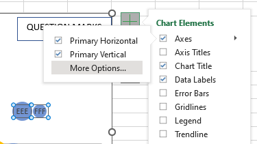
To make this change, again click on the large plus button to the side of the chart, and click on Axes and then across to more options, as shown below.
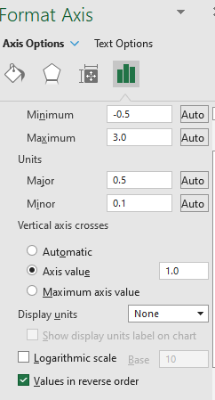
Then in the function box, near the bottom, you will see a check box for reverse order – as shown below – make sure it is picked and the X axis will run in the right direction for the BCG matrix.
STEP 6: Remove Gridlines
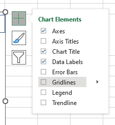
We want to remove the gridlines from the chart. To do this, click on the chart and bring up the large plus icon again. Click on it, and then deselect gridlines from the side menu, as shown below.
STEP 7: Set Axes, Intercepts, Tick Marks
We then need to undertake the formatting of the axes for the matrix. Obviously, to form a quadrant looking chart, as it is a matrix. This means that we want the axis intercepts to run through the center of the chart, rather than to the side.
To make these changes we click on the chart, bring up the large plus icon again, and click on axis more options -like we did when reversing the order of the X axis above.
At this time we need to work through the following changes:
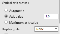
- for Vertical axis crosses – select axis value – enter 1.0 – and this will ensure that the relative market share is split at 1.0, with Stars and Cash Cows on the left hand side (note: you could use a lower score get more appropriate, please see the article on Where to Draw the Line)
- for Display units, ensure it is set to none, as we do not need numbers running across the axis, as the BCG matrix is more of a visual tool that a numerical tool
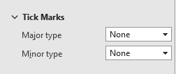
- and then scroll down to Tick Marks, and ensure that both major and minor types are set to none – this will give is a smooth line for the axis in the matrix
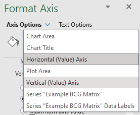
We then repeat the process somewhat for the vertical/Y axis. To format the Y axis we need to go to the top of the functionality box, click on Axis Options, and then click on Vertical (Value) Axis, as shown below.
We repeat the steps as above with one change to the intercept cut off. Here are the full steps repeated, but with the required change:
- for Horizontal axis crosses – select axis value – enter 0.1 – and this will split the BCG matrix horizontally at 10% market growth rate. Again, you may choose a different percentage to differentiate between Stars and Cash Cows etc.
- for Display units, ensure it is set to none, which is the same as what we did above for the horizontal axis
- and then scroll down to Tick Marks, and ensure that both major and minor types are set to none – again, the same as above
STEP 8: Add Text Boxes
The next step is to add the boxes that contain the labels of the four quadrants, namely Stars, Question Marks, Cash Cows and Dogs.
To do this, we click on the chart directly and make sure that is highlighted, and then we insert a text box or a rectangle and type in the appropriate quadrant and move it to the correct position.
Alternatively, you could use the function box and make the box contents equal to a cell, like the formula. If you have not done this before, this is outlined in the following videos on how to add text boxes to Excel charts.
STEP 9: Format and Colors
The final step is to format and color the BCG matrix as required. This is done the same way as you would for any chart in Excel. Simply click on the chart to bring up the chart menu, and then select Format from the top menu and change is required.
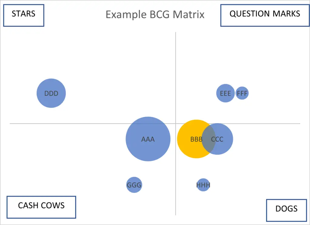
And your final BCG matrix – if you have used the above data – should look like this:
Related Articles

